

Ijraset Journal For Research in Applied Science and Engineering Technology
Cognitive Visualization
Authors: Prathamesh Karanjkar, Viraj Patil, Shrikant Gupta, Prof. Reena Deshmukh
DOI Link: https://doi.org/10.22214/ijraset.2022.41162
Certificate: View Certificate
Abstract
From childhood to every stage of life we deal with data, but we know very well how it is tedious to find out what actually we want. Because data contain redundancy, null values, duplicate values or sometime unnecessary data. That’s why it quite difficult to grab precise and necessary data from that vast data. Our main goal is to minimize users effort to get the actual output which helps in decision making process without any scarcity. We have tools that are easy to maintain and easy to use which can use to visualize sorting algorithms, double pendulum, code visualization, own data and even GDP of countries and Solar Explorer that helps astrologist to visualize rotation of planets, their speed and orbital inclinations of each and every planet. We believe to reach ultimate goal of user without any complexity and waste of time.
Introduction
I. INTRODUCTION
Information visualisation is the graphical illustration of records and information. By using visible factors like charts, graphs, and maps, data visualisation gear provides an easy way to see and recognise developments, outliers, and patterns in statistics. In the age of big data, fact visualisation equipment and technology are important to analyse large quantities of information and make fact-driven decisions. Why is fact visualisation vital? Because of the way the human brain strategies data, using charts or graphs to visualise large quantities of complex statistics is easier than poring over spreadsheets or reports. Record visualisation can also identify regions that need interest or development. Fact visualisation entails imparting records in graphical or pictorial form, which makes the information easy to understand. It enables us to provide an explanation for records and decide publications of action. It will benefit any area of study that requires revolutionary methods of supplying big, complicated facts. The advent of PPC photographs has formed the current visualization. This paper provides a quick way to create statistics visualisation [1].
You will get to know how with the help of tools such as code visualization, GDP visualization, Sorting Algorithms, Solar Explorer and Double Pendulum you can able to perform complex, hefty task in a simple and innovative way. Understanding the perceptual and cognitive processing of a visualization is essential for effective data presentation as well as communication to the viewer [2]. Mai goal of this paper is to practice of translating information into a visual context, such as a map or graph, to make data easier for the human brain to understand and pull insights from.
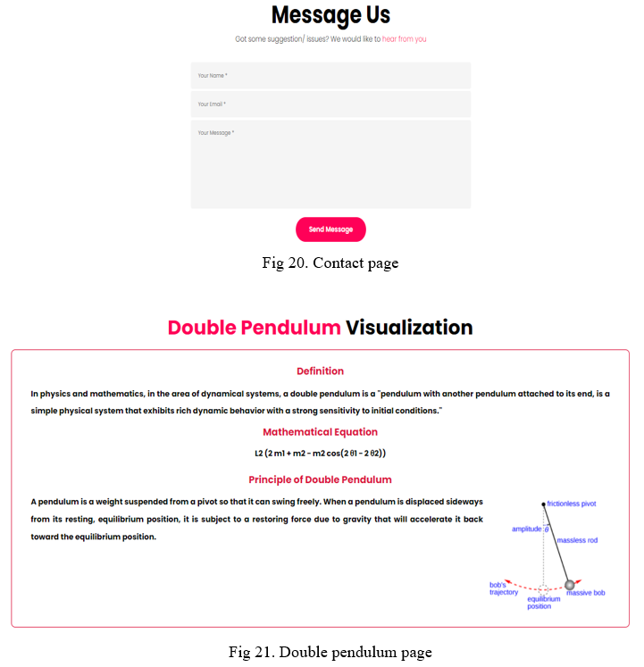
A. Double Pendulum
In physics and mathematics, within the area of dynamical systems, a double pendulum is a pendulum with every other pendulum attached to its give up, is an easy bodily device that reveals wealthy dynamic behaviour with a sturdy sensitivity to initial situations.
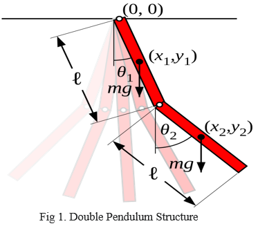
It is convenient to use the angle between each limb and the vertical as the generalized coordinates that determine the configuration of the system. These angles are denoted θ1 and θ2. The position of the centre of mass of each bar can be expressed by these two coordinates. If we take the rest point of the first pendulum as the origin of the Cartesian coordinate system, then the centre of mass of this pendulum is at the point:
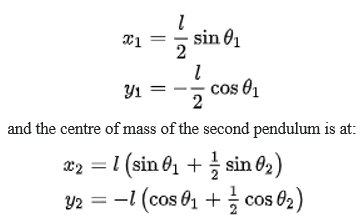
The chaotic behaviour of pendulum is generally associated with the random pressure acting on a pendulum (Brownian movement). any other form of chaotic motion (deterministic chaos) occurs in nonlinear systems with simplest few stages of freedom.
With the tool you can demonstrate all the properties in easy and convenient manner to get actual working about double pendulum.
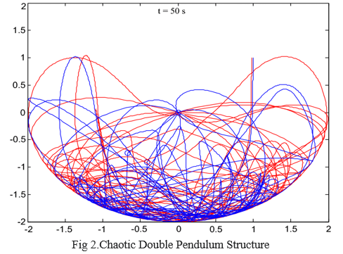
B. Code Visualization
Numerous novices presume that they'll fail in programming earlier than they step into the coding world. while a newbie programmer sees quite a few standards in coding it becomes overwhelming for them. They start having self-doubt, and they allow some terrible thoughts come to their thoughts. There must be a time period for it: perhaps programophobia. Or in place of a worry of coding, it may in reality be a worry of builders themselves, or a fear of era, rooted in a lack of information. something the purpose, many groups seem to go through tension at the concept of programming.
Code visualization bridges the distance among what you believe you studied your machine seems like and what it in reality looks like assisting you understand what you're running with and making it less complicated to organize and collaborate with self-belief. Visualizing code is critical for smooth, efficient, and effective development. visual documentation of your code guarantees you not handiest have the information prepared however that they're conceptualized in an extra accessible way. Visualizing code helps you in distinct methods like discover and fasten bugs, Conceptualize massive-scale tasks, Visualize dependencies, Collaborate with others, Onboard new software program developers, recognize the person waft, recognize the person drift.
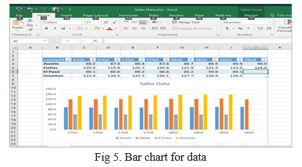
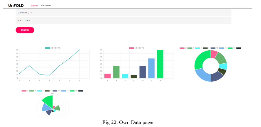
C. Own Data Visualization
We've got databases, excel sheets, cloud garage, files and there are lot of ways. however what if we are able to visualize our very own records on every occasion we need to meet our necessities, it’s superb right!. via thinking about this we have created personal records visualization device which helps to visualise own statistics in shape of line charts, pie charts, bar charts and in doughnut form with meaningful and attractive shades. you could display your statistics analysis reviews in some of methods. but, in case your records evaluation consequences may be visualized as charts that spotlight the fantastic factors inside the statistics, your audience can speedy grasp what you want to task inside the information. It also leaves a very good impact to your presentation style. sometimes, we must rely upon assessment to locate the powerful result. this is additionally the middle goal of own data visualization.
It can prepare and to teach you how to respond to a situation before it happens this is a importance of this tool.
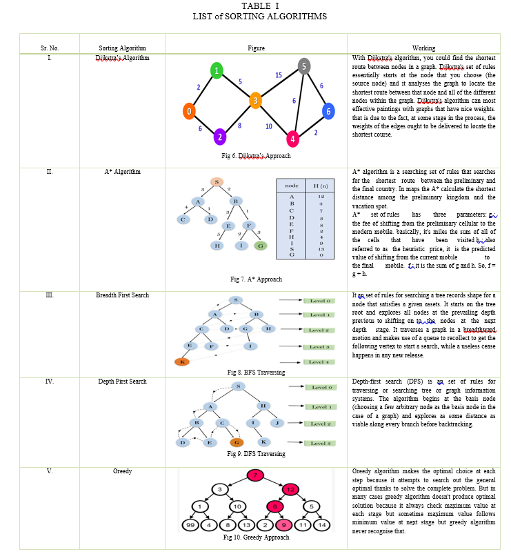
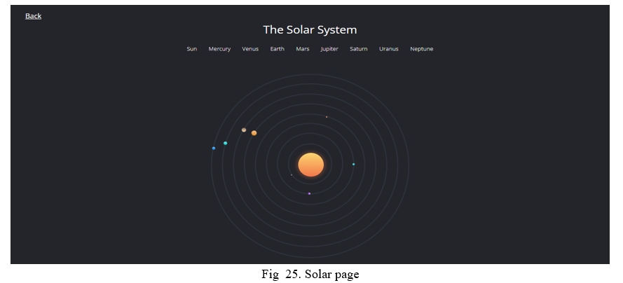
D. Visualization of Sorting Algorithms
From putting elements in list in ascending order to find the shortest path sorting algorithms plays a key role. We read and applied them theoretically, but this tool will help you to understand it visually from different sets of algorithms.
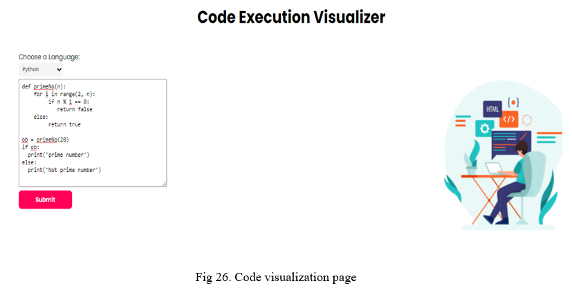
E. Solar System
Perhaps one of the easiest ways to get your child interested in solar machines is to show them a visualization. Making the solar system interesting in conversation can be difficult. However, rendering renderings in seconds or 3D makes detection easier and can bring planetary science to life. The study of the solar system has added to our understanding of phenomena such as gravity, magnetosphere, atmosphere, hydrodynamics, and the geological evolution of various planets.
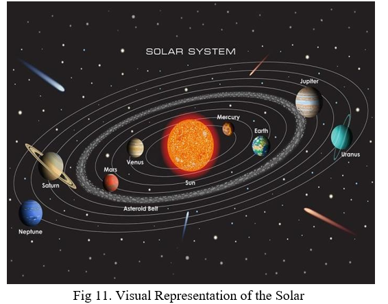
The importance of this tool: it helps you by providing a lot of useful information about planets and by visualizing the solar system in 2D and 3D with your eyes. You can select each planet and get some useful information like radius, distance from the sun and orbital inclination.
The reason why stars are so important is that they have helped humans navigating throughout the Earth. When it had been dark, these stars would illuminate the sky, giving people light. A constellation may be a star group that forms a selected pattern or shape supported the positions of the celebrities. The constellation shape is set by the brightest stars within the constellation and, when it's viewed from Earth, usually resembles an animal or an object and would fitly be named after its appearance or some unique creature.
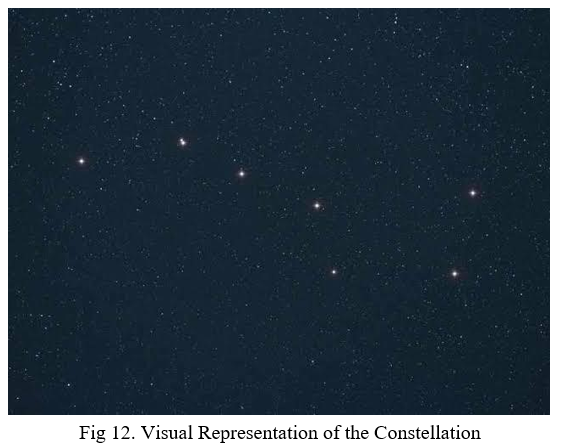
This tool also provides you with a visualisation of stars, and you can explore the constellations that we see in the night sky.
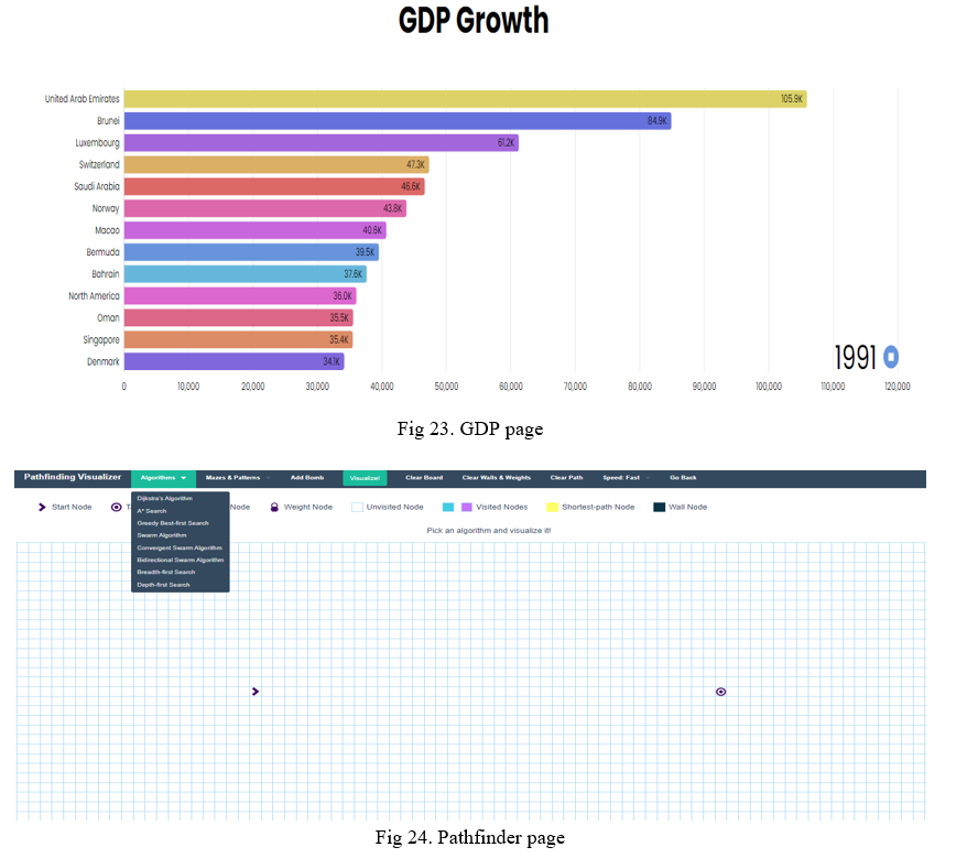
F. GDP Growth
Gross home product is used to measure the cost of very last items and services produced in a yr. GDP are commonly used to determine economic overall performance of a whole region, and to make the comparisons worldwide. anybody ought to be knowing GDP as it offers information approximately the scale of economy and the way the economic system is acting. GDP increase charge is also used for indicating fitness of people. If GDP is increasing then we are able to realize that the economy is doing very well.
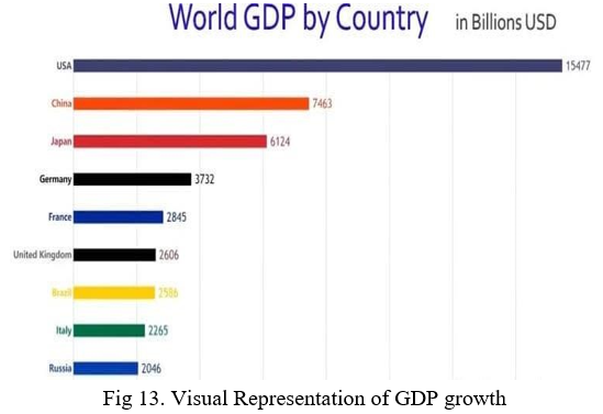
The importance of this tool is that it helps you understand the GDP growth visualisation very clearly. From this, you can watch live how GDP is growing from 1990 to 2018. Also, if you want to know which country took over which in terms of GDP, this tool will help you see it in graphical visualisation.
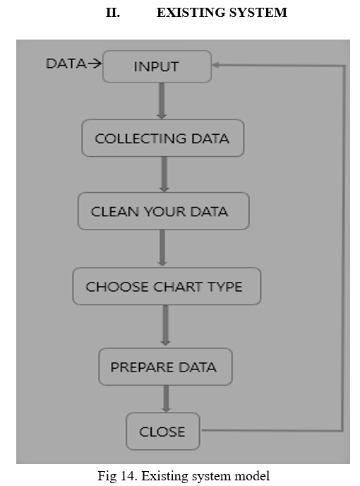
Records evaluation is a technique of collecting, reworking, cleaning, and modelling facts with the intention of coming across the specified information. information analysis is a method of amassing, transforming, cleaning, and modelling information with the goal of discovering the specified facts[1]. The effects so obtained are communicated, suggesting conclusions, and helping selection-making. statistics visualization is at instances used to painting the records for the convenience of coming across the useful patterns inside the records. data evaluation process consists of the subsequent phase es which can be iterative in nature[2]-
- Data Requirements Specification
- Data Collection
- Data Processing
- Data Cleaning
- Data Analysis
- Communication
The facts required for evaluation is based on a query or an test. primarily based on the requirements of those directing the analysis, the information necessary as inputs to the evaluation is recognized (e.g., population of human beings)[3]. information collection is the process of accumulating statistics on targeted variables identified as information requirements. statistics series provides each a baseline to measure and a goal to improve[2]. The records that is amassed must be processed or prepared for evaluation. This includes structuring the statistics as required for the applicable analysis gear [2]. The processed and organized records can be incomplete, incorporate duplicates, or incorporate errors. facts cleaning is the system of stopping and correcting those errors[6]. facts that is processed, prepared and wiped clean would be equipped for the analysis. various records evaluation strategies are to be had to understand, interpret, and derive conclusions primarily based on the necessities [7]. The effects of the statistics analysis are to be suggested in a format as required through the users to help their selections and further movement. The comments from the customers may bring about extra analysis [2].
Disadvantages of Existing System contain lack of labelling provides unnecessary contact, increases order faults & decreases organization. Absence of effective highlighting causes negligence towards important parts, trends, insights and hidden patterns. Comparison tools not present in existing which causes missing of quantitative as well as qualitative data. Actions and reactions totally absent due to non-colouring techniques. Sometime gets outputs in unsynchronized manner due to lack of ordering.
III. PROPOSED SYSTEM
Proposed system nothing but upgradation in existing system to make it more featurable, more advance and reliable for use. Proposed system explains what you are going to do this project. What is your project and what is new in your project other than existing things. Proposed system includes steps given as follow, Collection of datasets, extracting features and training model, testing and optimization of model. We will also scrape data from various sources available.
Let’s see how this steps carried out to make data more valuable and readable.
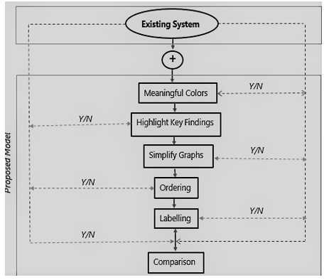
- Meaningful Colors: Applying colour to exclusive parts of your visualization lets you inform a more effective tale, one which engages your audience at an emotional stage and captures their interest speedy. well-selected shades lessen the time to insight on your visitors and facilitates them recognize your message quicker and more easily. In data visualization, coloration units the tone and enforces a message for the underlying visible display. It creates a positive environment and might turn an unassuming visualization into an emotion-stuffed statistics tale.
- Highlight Key Findings: In quick Visualization is the graphical show of records. The motive of this spotlight key finding is to offer the viewer a visible method of processing the statistics. it's far vital to word that for a visualization to be effective it need to draw upon the information base of the viewer. In quick Visualization is the graphical display of facts. The purpose of this graphical display is to provide the viewer a visual means of processing the statistics. it's far vital to be aware that for a visualization to be effective it have to draw upon the understanding base of the viewer.
- Simplify Graphs: Simplify graph is any other commonly used term, and it refers particularly to the process of analysing statistics in a graph format the use of data points as nodes and relationships as edges. analysis is carried out the use of systematic strategies to look for developments, groupings, or different relationships between different forms of records. it's far the manner of placing statistics right into a chart, graph, or different visible layout that enables tell analysis and interpretation. It uses logical strategies to explain and illustrate, condense and recap, and compare information.
- Ordering: Graphs are a common way to visually describe relationships between facts. The purpose of ordering is to suggest data that is too many or too complex to define correctly in a smaller area. All professional industries benefit from understanding information. Thus, information visualization extends to all areas where statistics exist. For any business, data is the most pervasive leverage. Bring plenty of points when ordering so you can enjoy this data without wasting the time.
- Labelling: Records labelling is the manner of figuring out uncooked records (pictures, text documents, movies, and so forth.) and including one or extra meaningful and informative labels to offer context so that a system gaining knowledge of model can research from it. facts labelling is critical for reaching that superiority. Labels may be received through asking humans to make judgments about a given piece of unlabelled facts. Labelled statistics is drastically greater precious to gain than uncooked unlabelled information.
- Comparison: This one is step which remain common in both current and proposed. but as we saw preceding steps of proposed which makes evaluation greater effective in proposed the present due to specific and first-class records passed off in proposed. evaluation is nothing however selecting right charts and evaluate them to assist in decision making manner and Comparisons permit us to form a baseline. As we've already existing machine, the addition of this proposed methods will be show as full-size manner to get specific and audience targeting output which in the end turns into first-class proposed version in terms of facts visualization.
As this steps facilitates students arrange and examine facts in nicely-based formats, making it less difficult to interpret records. visible freshmen respond especially nicely to graphs and regularly recognize the data better without pages of textual content. The cause of highlighting is to draw attention to crucial records in a textual content. effective highlighting is effective because it first asks the reader to select out the vital components, after which offers an effective way to study that facts later. colour can sway wondering, exchange movements, and cause reactions. Labelling and Ordering presents Minimization of needless contact, increases Order Accuracy & complements employer. contrast gear which assist examine among two phenomenon’s, gear, procedure, gadgets or organizations of facts. They provide us with both quantitative and qualitative records.
IV. WORKING
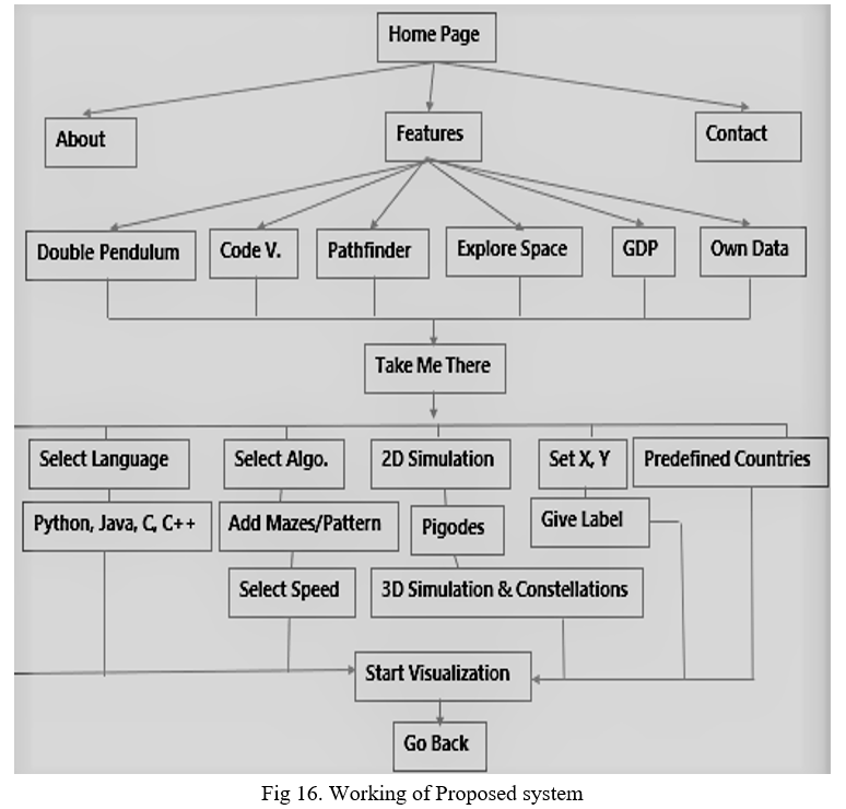
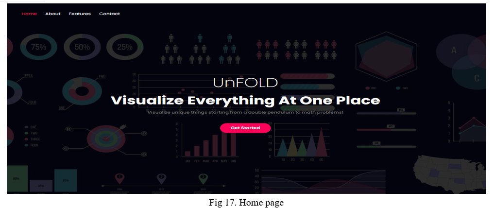
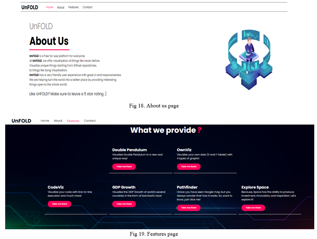
- Step 1: User after coming to home screen, can see description about our self and then choose feature.
- Step 2: After Selecting Features section there are option such as code, GDP, Pathfinder, Pendulum, Explore Space, etc.
- Step 3: After selecting respective visualization technique he/she can go further with succeeding steps ahead. (Refer below working diagram for each steps)
- Step 4: Choose close option after successively getting required output.
- Step 5: You can contact us by simply going to Dashboard by filling some details.
For more understanding, refer the steps in subsequent figure where each and every step in proposed system mentioned in sequential manner.
V. FUTURE SCOPE
In this era of big data waves everywhere, the scope of data visualization is much larger than expected. Organizations today generate vast amounts of data. Managing, structuring, and reading this data can be a daunting task. But with data visualization technology, you can not only read this data, but also use it in your business.
Operational Alerts – This keeps sales, marketing, and internal process teams informed about new promotions, product launches, and more. Data visualization allows you to send real-time visual alerts to your team.
Mind Maps – A diagram-making tool, Mind Maps are used to create and visualize structures and relationships, classify ideas, observe and manage information, make decisions, and solve other business problems.
VI. RESULTS
This project deals primarily with visualizations. It provides free tools to help users visualize a variety of unique things, from double pendulums, custom mathematical equations, code visualization, GDP growth, pathfinders to space exploration. In today's business world, so much information is gathered through data analysis that we need a way to draw a picture of that data so that we can interpret it. Data visualization provides a visual context through maps and graphs to give a clear idea of ??what the information means [2]. This makes the data easier for the human mind to understand, and therefore makes it easier to find trends, patterns, and outliers in large datasets. In particular, data visualization uses visual data to convey information universally, quickly, and effectively. This method helps companies identify areas that need improvement, factors that influence customer satisfaction and dissatisfaction, and what to do with a particular product (where to go and to whom to sell it). Decision makers more accurately predict sales volume and future growth [3].
VII. ACKNOWLEDGEMENT
We sincerely wish to thank the project guide Prof. Reena Deshmukh for her encouraging and inspiring guidance helped us to make our project a success. Our project guide makes us endure with her expert guidance, kind advice and timely motivation which helped us to determine our project.
We would like to thank our project coordinator Prof. Reena Deshmukh for all the support we needed from her for our project.
We also express our deepest thanks to our HOD Dr. Uttara Gogate whose benevolent helps us making available the computer facilities to us for our project in our laboratory and making it true success. Without his kind and keen co-operation our project would have been stifled to standstill.
Lastly, we would like to thank our college principal Dr. P. R. Rodge again for providing lab facilities and permitting to go on with our project. We would also like to thank our colleagues who helped us directly or indirectly during our project.
Conclusion
The approach proposed presents a solution to visualizing various tools such as code execution, double pendulum, solar system, GDP growth, searching algorithms, and own data visualization. The tools implemented allow us to understand the insights of the datasets and can also help in learning and education. At the same time, it is clear that the field is rich in potential applications in diverse applications. We should be aware its practical and ethical complexities as it is time of need. We have also discussed and critiqued several examples of data visualization, learning common pitfalls and helpful tricks along the way. As we have seen, developing an effective and ethical data visualization process is a complex process. And finally, we communicate a data set effectively by using graphics.
References
[1] Amal Davies, A.Ganesan, “Data visualization for real-time information”. (Jun 2018) [2] Hangjung Zo and K. Ramamurthy, “Visualization Of Online Datasets” (Jun 2017) [3] Alpa K. Oza, “Data Visualization for University Research Papers” (Jan 2018) [4] Michelle A. Borkin, Zoya Bylinskii, “Beyond Memorability: Visualization Recognition and Recall” (Aug 2015) [5] JIAYING LIU, TAO TANG, WEI WANG, BO XU, XIANGJIE KON, “A survey of Scholarly Data Visualization” (Sep2017) [6] Matthew N. O. Sadiku1, “Data Visualization” (Dec 2016) [7] Edward Segel and Jeffrey Heer, “Narrative Visualization: Telling Stories with Data” (Oct 2010)
Copyright
Copyright © 2022 Prathamesh Karanjkar, Viraj Patil, Shrikant Gupta, Prof. Reena Deshmukh. This is an open access article distributed under the Creative Commons Attribution License, which permits unrestricted use, distribution, and reproduction in any medium, provided the original work is properly cited.

Download Paper
Paper Id : IJRASET41162
Publish Date : 2022-04-01
ISSN : 2321-9653
Publisher Name : IJRASET
DOI Link : Click Here
 Submit Paper Online